Bird Restaurant {London}
06 July 2015

Don’t mess with a girl and her fried chicken!!
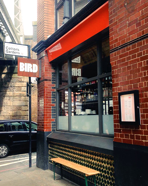
The thought of fried chicken and waffles served together is, depending on your viewpoint, either gloriously appealing or somewhat frightening. Who knows, maybe both. I never understood the fried chicken and waffle hype until my trip to Vegas earlier this year and experienced the chicken and waffle hype over there! I’ve not managed to find a chicken and waffle plate here in London until I stumbled across Bird, situated on Kingsland Road in between Hoxton and Shoreditch.
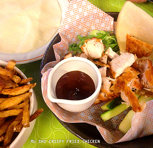
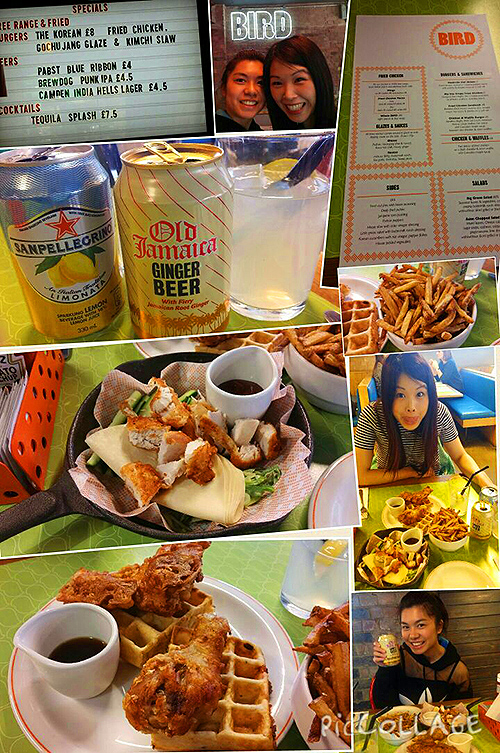
A restaurant that aims to challenge perceptions of fried chicken as a low quality snack. We ordered the Mu Shu Crispy Fried Chicken – Chopped fried thighs, thin Chinese pancakes, cucumbers, scallions, tonkatsu sauce; and the Chicken & Waffles – two pieces of crispy fried chicken on a fresh cheddar & onion waffle, with Canadian maple syrup. The fried chicken is super crispy, the batter is seasoned nicely and is the right amount of crispiness. The waffle wasn’t too thick and overly bready, so you won’t feel like, major-carb-overload after each bite. The great part was we didn’t feel heavy and in need of a nap right after finishing everything.
After the chicken, there’s dessert, Bird also offer homemade donuts (which are apparently all the rage), but I’ll have to taste them for myself next time – a sweet reason to go again!
FOCUS: Identity, Graphics & Retail Design {Opinion by Cindy Cheung}
Bird’s identity nicely blends a sense of playfulness, current restaurant trends and family dining heritage. The logo-type has clearly been really well crafted that infuses a great sense of individual personality (linking together with the establishment’s food values of using chicken that is sourced responsibly and cooked with recipes developed by Bird’s founders). Use of a bright but limited colour palette enhanced by plenty of white space secures a strong aesthetic impact that mixes the familiar fresh and fruity hues.
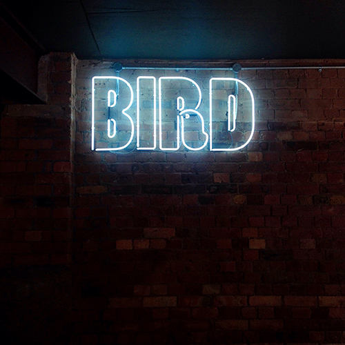
The logo punctuated by a moment of play within the ‘R‘ – the use of a bird iconography is clever and unexpected. This bird iconography has been used to create a series of patterns, which is applied to the menus, condiment caddies and colourful lime table tops (see pics above). Bird’s illustrated character is also executed as a large neon sign hung on the wall in the middle of the restaurant, looking stylish and confident – these guys obviously know a good looking sign’s important in the hospitality sector.
The orange colour palatte is featured consistently on the greaseproof paper that our chicken was served on, light fittings, hanging picture frames and on the vintage chairs – coated in glossy oranges and reds. The place is bright (due to the large windows letting in plenty of natural light), super shiny and felt fun to eat in. Loved the branded table tops and hand wipes on the table and the great taste in music too (those details).
If you’re in East London, and you like crispy fried chicken, Bird is worth popping by. You can view their their menu right here!
{Photos by Siu Ann Lai and Cindy Cheung}
Missie Cindz
