Sushi To Go – Sushi Express
03 August 2011
Sushi Express ‘Sushi To Go’ identity and packaging design. July 2011.
I was well happy when the people at Sushi Express came to find the Missie Cindz to talkabout a new packaging design. With a plan to reintroduce sushi ‘to take-out’ to the retail customer through a new brand that would be relevant and meaningful to the consumer looking for a fresh and healthy alternative to traditional on-the-go fare.
Sushi Express offer grab-and-go sushi, boxed meals, lunch deals and Japanese drinks within small footprints located on consumer pathways – You can eat-in, have meals delivered or pop into the restaurant for a collection. I developed the concept using bold, striking visuals and Japanese-inspired materials. It was important for Sushi Express to capture the ‘eating healthily on the go’ audience in their environment and to inspire supermarkets to start selling packaged sushi to Sheffielders, allowing people in areas where Sushi Express hadn’t arrived yet to take their first steps in discovering how tasty and healthy sushi can be.
The Design
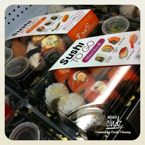
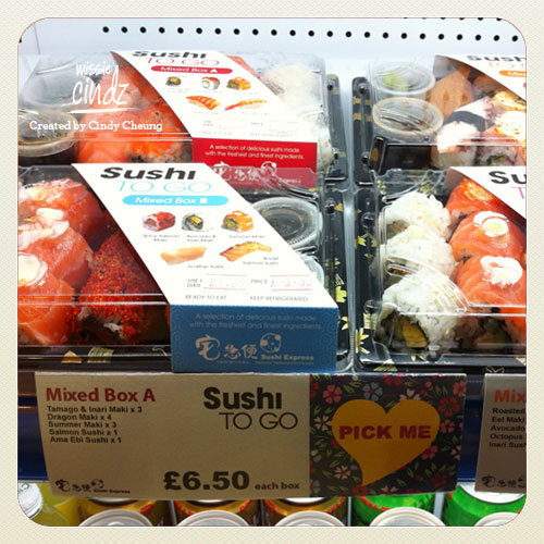
I wanted the ‘take-out’ sushi brand to echo excitement and joyful eating moments – kinda like saying wave ‘cheerio’ to boring sandwiches/canned soups and say ‘helloooo’ to the healthy and exciting ‘Sushi To Go’ range! Product imagery helped create appetite appeal – plus knowing what’s in the box and familiarising each sushi item with the consumer helps to connect with the food we’re eating. I looked to offering real health benefits for consumers looking for a healthier food choice. ‘Sushi To Go’ resonate with Sushi Express’s ethos: offering a wide variety of sushi at affordable prices whether to dine in, for takeaway or delivery.
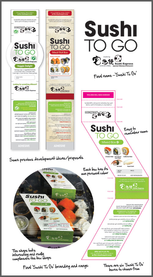
There are six different labels (box A – F), each having their own personal colour which compliments its sushi contents. For example green for vegetarian, purple for more luxurious meat items and blue for lighter sushi fillings. The shape gives the packaging some dynamics and depth, makes good use of the containers space and presents the food in a way which helps it say ‘hey, eat me!’ :)
Sushi Express ‘Sushi To Go’ is available in their restaurant on Milton Street, Sheffield and in Tai Sun Oriental Supermarket (17-19, Matilda St or Sheffield’s Parkway) from Wednesday 3rd August. Let me know your thoughts on the packaging – it’s always good to hear constructive feedback. Thanks! – Cindy/Missie
Missie Cindz
